Traces Menu / Plotting
Showing the Plot
Click on the Display button to show a plot of the data that
was collected from the test that was just run. Previously saved data can also
be collected and graphed.
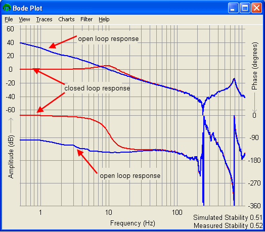
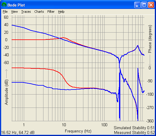
The default view is shown above. The red line is the closed
loop response. The blue line is the open loop response (simulated from the closed
loop response). The top half of the window is the Amplitude Response and the
bottom half is the Phase Response.
Traces
Under Traces on the Bode Plot window menu, six traces can
be selected. Each trace represents a different colored line displayed on the
graph. This allows you to choose which traces you wish to display in the
graph.
Simply click on a trace to either have the data graphed or not. The traces
that are graphed are denoted by a check mark (The data collected from a
sine sweep test is Closed Loop -> Measured).
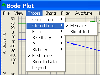
The following traces are available:
Open Loop -> Measured - (G) This is the simulated open loop response calcluated from
the closed loop data collected.
Open Loop -> Simulated - (G) This is the simulated open loop response above with a simulated
fitler simulated in addition.
Closed Loop -> Measured - (G / (1 + G)) This is the data collected directly by the sine
sweep test.
Closed Loop -> Simulated - (G / (1 + G)) This is the data collected with the filter on
the axis being tested applied via simulation.
Filter -> Simulated - This is a simulation of the filter on the controller.
Filter -> Measured - This is a simulation of the filter that was on the controller
at the time the Bode data was taken.
Sensitivity -> Simulated - (1 / (1 + G)) This is the Sensitivity of the closed loop response
using the simulated filter.
Sensitivity -> Measured - (1 / (1 + G)) This is the Sensitivity of the closed loop response
using the filter that was on the controller at the time the Bode data was taken.
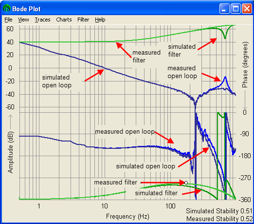
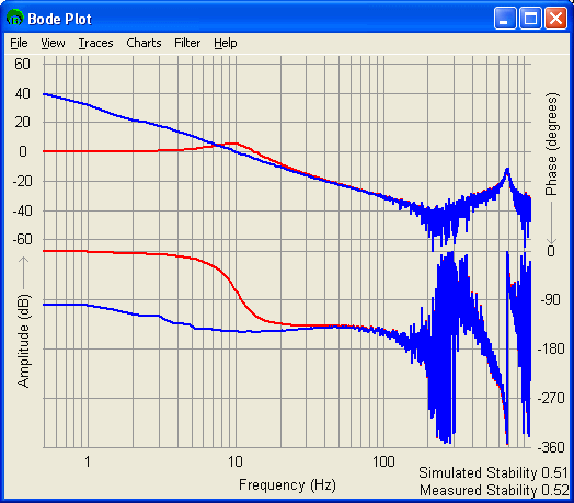
Any combination of the above traces can be shown at the same
time. Shown below is a plot of the open loop response, filter, and filtered
open loop response of a particular system.
For more information on how the filters are simulated, see
the Filter Simulation section.
All - You can quickly turn groups of traces on and
off using the All menu item. The menu items in the All section do not get checks
next to them. The associated items that they operate get checks turned on or
off.
All -> Measured -> On Turns on all the measured traces mentioned above
All -> Measured -> Off Turns off all the measured traces mentioned above
All -> Simulated -> On Turns on all the simulated traces mentioned above
All -> Simulated -> Off Turns off all the simulated mentioned above
All -> On Turns
on all the traces mentioned above
All -> Off Turns
off all the traces mentioned above
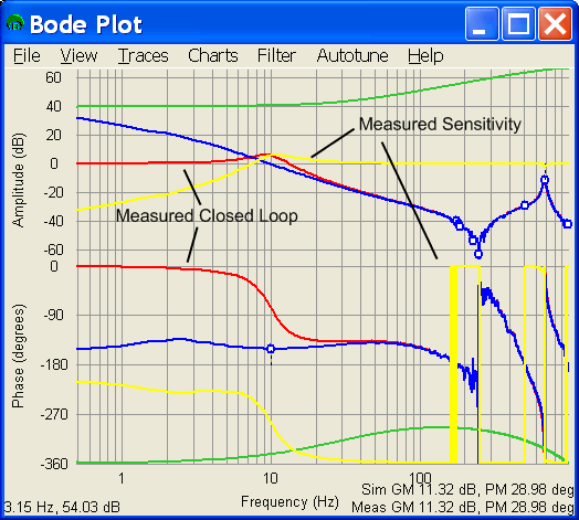
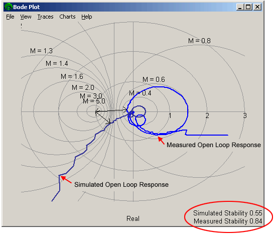
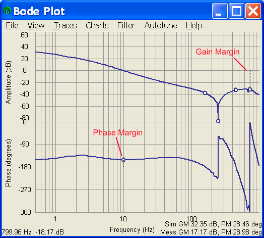
Stability
There are two types of stability measurement available. You
can use these measures to get a quantitative measure of how stable the system
is.
Traces -> Stability -> Stability Displays
the Stability plot as show on the stability page
Traces -> Stability -> Gain / Phase Margin Displays the Gain and Phase Margin plot as show on the stability page
Traces -> Stability -> None Turns off
all stability measures
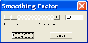
Smoothing Data
You can smooth out noisy data with the Smooth Data menu item.
The data smoothing is not saved to the file, so you don't have to worry about
corrupting your data.
To smooth the data, click Traces -> Smooth Data. You will get a pop up window to select the amount of smoothing
you want to perform.
You can choose the amount of smoothing you would like to perform
by adjusting the slider or typing in a value into the edit box. The smoothing
is performed by averaging all data points within x percent of the data point
in question, where x is the smoothing value you choose in the smoothing pop
up window.
An example of before and after smoothing:
Before
After: The same data after 3 percent
smoothing.
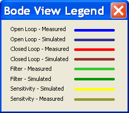
Trace Legend
Because several traces can be show at the same time, the Bode
Tool uses a rigid set of colors to indicate which trace is which. A legend is displayed bBy clicking
Traces -> Legend.
A small window will pop up that shows which color trace is
which. The line width is exagerated in the legend so the colors are easier to
see. The window can be repositioned to a convenient location for reference when
looking at the plots in the view window.
Previous | Next |

