Charts Menu
A brief summary of each chart type is shown below. Only the Closed Loop Unfiltered Response is shown for visual clarity. The four plots below show the same set of data in the four different forms.
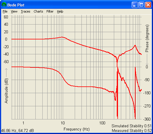
Bode
This is the Classic Frequency Response chart that shows Log Amplitude and phase vs. log scale frequency. The Phase Response is in the top half of the window, while the Amplitude Response is in the bottom half of the window.
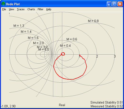
Nyquist
The Nyquist (or polar) chart is often used to (though not limited to) determine the stability of a system. The Imaginary Linear Amplitude Response is plotted against the Real Linear Amplitude Response. The grid lines are unit circles.
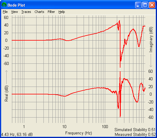
Real / Imaginary vs. Phase
The Real / Imaginary vs. Frequency chart shows the Log Real Amplitude Reponse vs. Frequency in the top half of the window and the Log Imaginary Response vs. Frequency in the bottom half of the screen.
The Real / Imaginary vs. Frequency Response is often used to verify a resonance when the real response is at a local min or max, while the imaginary response is at a point of inflection at the same frequency.
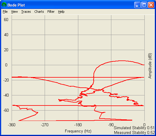
Amplitude vs. Phase
The Amplitude vs. Phase chart simply plots the Log Amplitude Response vs. the Phase Response. This plot is often used in conjunction with a Nichols chart.
Previous | Next

